Greetings fellow portable-appers!
(UPDATE: PortableApps.com Platform 2.0 Beta 5 has been released, so now you can try out many of these features today.)
As we've had a lot going on both publicly and behind the scenes lately in the countdown to 2.0, I figured the best topic for my inaugural blog posting would be a preview of the upcoming 2.0 platform. For the new users, the PortableApps.com Platform is the glue that lets you tie all your apps together. It currently consists of the PortableApps.com Menu; which has the ability to install and uninstall apps as well as manage your icons, check your drive for errors and more; and the PortableApps.com Backup Utility which allows you to backup and restore your documents, portable app data (bookmarks, email, settings, etc) and your entire portable device. The 2.0 platform is adding an array of new features including a brand new theming engine, file associations, portable fonts, categories and other icon arrangement options, an integrated updater, platform extensions, FULL Unicode support and more. Today, we'll be exploring a few of the new features that will be appearing in 2.0, many of which will appear in Beta 5!
Read on for more details on PortableApps.com Platform 2.0...
PortableApps.com Updater - Keep All Your Apps Up To Date
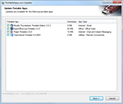
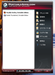
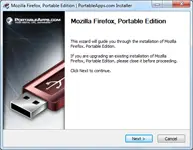
The next beta will see the first public appearance of the new PortableApps.com Updater. The updater can automatically check all your apps in PortableApps.com Format and let you know which are out of date. When out-of-date apps are found, you'll see a notification and list of them as you start the PortableApps.com Platform, at which point you can uncheck any you don't wish to update, click Cancel if you don't have the time to update right then, or click Next to have it automatically download and install all the updates. The PortableApps.com Updater works directly with the PortableApps.com Installers that all the apps are packed in so all the updates can install without prompting you for additional information, automatically installing the same options as before (additional languages, etc) and not reprompting you to agree to a license you've already agreed to (freeware, etc). A screenshot of the update prompt is shown below:
New Theming Engine, Over 30 Built-In Themes, And New Aero Theme
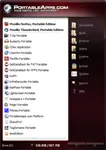
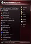
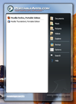
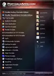
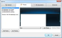
The next beta will also see what should be the final version of our new theming engine. This new theming engine makes customizing the look of the PortableApps.com Platform even easier than before and has a lot more functionality than the last beta. It has two built-in standard themes similar to the look of the current platform: PortableApps.com Light and PortableApps.com Dark. These have 15 included colors each, along with the abilty for the user to select their own custom color. The light version uses a standard white background on the app list with black text. The dark version uses a darker version that incorporates the color of the theme with white text. There is also a new aero theme that directly matches the look of your Windows Vista or Windows 7 aero theme coloring and blur. And all 3 built-in themes are available for themers to easily customize with a single image (see the rainbow theme) for simple customization. Check out the screenshots:
New Options Windows and Theme Selector
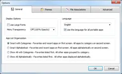
With all the new features and functionality, it made sense to introduce an improved way for users to be able to change options, pick themes and set other features within the platform. So, we've created an integrated options window with tab for general options, theme selection, file associations and advanced options. You can see the current incarnation below:
Full Unicode Support With 55 Translations (And Growing)
As PortableApps.com is the most popular portable software solution in the world, we have a ton of international users. So, we felt it was time to make the switch to full Unicode support. This enables us to support additional languages that we couldn't under the old ANSI platform (like Vietnamese and Serbian Cyrillic). It also allows the platform to run in the user's selected language regardless of the language Windows is in. That means that if you like your menu in Japanese or Korean or Chinese or Hebrew or Arabic, you can have your menu in your own language as you travel and use other people's PCs even if they're not in your own language.
Other 2.0-Related Updates
We've already begun posting updates in the countdown to 2.0. You've probably noticed the PA.c Format and PA.c Installer posted a few weeks ago. These include updates specifically for the new platform and updater, full unicode support, and an enhanced visual branding to match the new menu and website design. Just yesterday, we posted the PA.c Launcher 2.0, letting developers, publishers and advanced users make normal apps portable without writing any code.
2.0 Release Schedule
The next beta of the PortableApps.com Platform, beta 5, will be posted within about the next 10 days soon. We expect to be able to release the 2.0 final version later this year along with updates to the PortableApps.com website to increase community participation and enable better multilingual support. We'll be posting more as soon as it's available to our website, rss feed, twitter account and facebook page. So, stay tuned... the best is yet to come!
Best,
John T. Haller, head portable-apper
Subscribe to our RSS feed | Follow us on Twitter | Follow us on Facebook
- John T. Haller's blog
- Log in or register to post comments
Comments
Awesome News
I'm really looking forward to playing with these new toys.
Thanks for the work you and your team have put into into this
ditto
Update feature
The update feature will be very useful!
program sub-categories
it's impossible divided into program sub-categories ???
?
What do you mean by sub-categories?
I guess it will be the standard portableapps.com categories we use now for the apps so whats the advantage of sub categories?
Guessing that he means nested categories
For example, if you have 40 or 50 items in one category, can you split it down further?
A lot of people add a lot more than just the apps from here to their drive and menu, especially diagnostic and repair tools for people who often get called upon to "while you're here, could you take a look at my computer" when they visit relatives (*sigh*).
I know that my stick got up to 363 apps on the menu recently, until I moved two suites of utils out into their own separate menu system(s). It is back down to a mere 110 apps launchable from my PortableApps Platform launcher now
Smart Mode Helps
Smart mode will help with this a lot. The default setting is to have your favorites first followed by your most used apps. Those take up 19 slots in the menu. The 20th is "All Portable Apps" which takes you to a full scrollable list separated by categories. Even if you have 100 or 300 apps, you'll find that in a given day, you don't use more than a dozen or so normally. The goal is to keep those front and center, saving you time.
Wonderful. I always hide
Wonderful. I always hide these apps I rarely use. Now, I can keep them on the platform and just hide the ones that I never use that take up space on the platform. Well done John and your team! Really can't wait to see your hard work.
Shane Thompson
app rearrange option;)
well even just drag drop rearrange of icons would make things soo much nicer or rearrange in "PortableAppsMenu.ini" file would be great too so far i can do it only with favorites...:(
and maybe in the ini file adding separators as well witch would appear like as it appears for favorites..
Custom Themes
I like the idea of making custom themes for the new beta.
Great Version but there is another also to good
This beta version is really great, I have not experimented any trouble by now.
But let me tell you that there is another "Portable Apps" is named "Lupo Pens" and it is really great also. What I found very useful of this last one, is that all the apps are arranged in the principal menu by "category".
Maybe this input will be useful for having this funcionalaity for the oficial version 2.
Not So
We... don't like Lupo very much over here. He rips off PortableApps and posts them as his own work without any credit to us or changes to it at all. That way he violates both copyleft and trademark licenses.
I say that you come over to PortableApps.com, because everything here is fully compliant.
Categories are coming in 2.0, too.
Lupo
Thanks i'll make sure to stay away from him
Update of Mozilla Firefoxn And New Programs Request
Firefox Update
While setting up an 32GB SDHC card for a trip where it's difficult to get a computer in country without pay an exorbitant "user fee" I accidentally "updated" the Firefox running on Portable Apps.
It worked! Was this a fluke?
New Programs Request
Is it possible to convert:
1. MozBackup
2. NoScript
3. AVG
I don't know what will happen if the PortableApps system gets infected.
Bob
tuandbob@snip.net
to Portable App?
Updating Firefox Portable
Updating Firefox Portable through its own update system has always worked. The problem was that before the 3.6 release, the updater would rewrite existing registry keys to point to the location of Firefox Portable.
Love this!
This is looking awesome! I love the new look as well!
Yay!
Thanks for the update John. I'm looking forward to this!
w00tness!
w00tness! :cool:
Amazing
Just Pure Awesomeness.
sweet!
This looks really cool.
I cant wait until the next beta comes out xD
nice work!
Cool !
It's cool news!
Thanks for your great work! Good Luck!
Seconded
The new version has 2 features I've really wanted
1) Easy updating
2) Better themes
I really like the blue theme especially, goes great with my desktop - and all but 3 apps on every machine I run are Portable Apps, so this thing is always there
Sweet! Is the Glass theme
Sweet!
Is the Glass theme real Vista/7 Aero, or just a translucent theme that looks like it?
...
Looks like authentic glass to me. The blur effect is impossible to do with alpha translucency alone; Aero uses a pixel shader to do it.
Real Glass
It's real glass. And it will be available to themers for custom themes, too
What About XP
How does this theme display on Windows XP which, of course, does not have Aero or glass capabilities?
Fake Glass
We're working on a fake glass backup. We've encountered some issues when working with 2000/XP's drawing setup, so it may not be as full-featured as we'd originally intended, but it will be a decent backup.
When you use an aero theme in
When you use an aero theme in the latest opera you see the window border color instead of transparency, and it usually looks pretty good (save the original blue theme) ¿Wouldn't that be faster/ less resource-eater?
fake glass?
I tried to make a fake glass theme from screenshots of the windows 7 start menu.
This was b4 even fake glass support. it obviously didn't work. Anyway, im not sure if you know what im talking about, but you can look on vista and 7.
When you move a window the aero lines in the glass move. these are the lines you see when you peek at the desktop in windows 7. will this be replicated in the finnished 2.0?
Fake Glass
you can set transparent color in .GIF format pics. This could help w/ transparency
The issue with transparency
The issue with transparency has to do with the way Delphi handles it. Currently the format for the images in the menu is PNG, which handles transparency also, and is MUCH better in many other ways than GIF.
And, you can't use GIF files in the menu, it won't recognize the file type.
Transparency
Pls explain
It's about how the platform is coded.
The platform is coded using Delphi, an IDE that uses a variant of Pascal as its programming language.
The way that the code is designed, the files that make up the graphic portion of the menu are all .PNG files. If you are making a theme, you can only use .PNG files, and in fact, the files have to be specific names, like background.png, button_close_hover.png, etc.
John is working on recoding the platform to create the semi-transparency of the Aero-type theme, but he's not done yet, because it's trickier than it seems, so you have to wait.
Anyway...
Even if you could use .GIF files (which you can't), there is no advantage to that format. It's way out of date. .PNG files are superior in many ways, including supporting a much wider color range than .GIFs, as well as supporting transparency.
Wonderful News!
Looks and sounds great! I have liked what I've seen in the previous 2.0 betas and can't wait to get my hands on beta 5. I have been looking forward to the updater for a long time, it will sure beat digging through the site and manually checking every app for an update, especially with multiple portable drives. : o )
Keep up the good work!
Great!
Fantastic news. Categories, Updater and advanced theming is something people are waiting for for quite some time now.
Will the theming also include the possibility to have buttons and lay out change place or is the lay out static (as the theme examples show) I remember those wicket themes from a while ago with totally unique PortableApps.com lay outs.
Can't wait till it gets released in August
not that fantastic...
take a look at the new beta of [link to illegal software that has violated our copyright and the GPL removed by mod JTH. Please refrain from linking to illegally packaged software.]
Et Tu?
Trojan Ware!
WRONG
It's all about preference.
I came here first, i tried this first, it works better than anything else, I'm not going anywhere.
This is good quality software and I've never had any problems with it.
Although your illegal software may do the job and look nice at it, it cannot compare to the compatability, functionality, or quality of this platform.
Not to mention it is also freely and Legally distributed.
Maybe you should wait to try the final release before spamming. (Oh, and Don't say I'm biased for not looking there, I did look there before this page was moderated)
I am currently a happy 1.6 user and i also realise that this is possibly the future for many computer users as lack of software and admin restrictions become increasingly popular on office and school computers.
Good job to the Development team, I look forward to the new release.
I hope to one day also develop for this site when i find myself some more free time.
rediculous
well, of course you can call [illegal software platform removed] illegal, trojanware or else (what is in fact not !!!), but what i meant, is: THEY HAYE A REALLY COOL STARTER with the 5.0 beta !!!
With temporary file-assoziations, cool animation, a program tree, temporary desktop-shortcuts, recent & most-used stuff,...
THAT one is really fantastic !
Come on, John, some critics should be allowed...
critics and comparisons are fine, illegal software isn't
Critics and comparisons are just fine (unlike the site you are promoting which bans users for asking licensing and legality questions). And are actually encouraged. But discussins of illegal software are not permitted here. And the software suite you registered here just to promote has been proven illegal: stealing our software, violating the gpl and violating trademarks. Please refrain from linking to them or discussing their software further. We keep things above board here, thanks.
So called illegal
Come on, John, once again !
- they do not violate GPL : source code is available for their applications and there is no need to provide their launcher's source code
- they do not steal your software : in the first days, they provided your package to download (is it wrong if it's OpenSource ?). As soon as you asked for it, they removed these packages and developped their own.
The only thing left is that they use "Mozilla Firefox" and "Mozilla Thunderbird" trademarks. But it's mostly Mozilla's problem and from my point of view, is just a little thing.
As for critics, I have to agree they provide advanced features and it will take time to get to that level of quality... event if PortableApps Menu preview screenshots look promising
Off Topic
We're getting seriously off-topic here. The fact is that he used dozens of our apps illegally and trying to pass them off as his own, in violation of the GPL, copyright law and trademark law as it pertains to us as well as our licensing agreement with Mozilla. He did this with full knowledge of what he was doing and for well over a year. To this day, he still packages multiple software apps with all versions of the suite without permission and will ban or censor anyone who questions this in the forums. It's an illegal package and will probably always be so. So, it may not be discussed here, any more than illegal packages of Photoshop may be. They're all copyright violations and illegal.
The whole reason this began is because one user registered an account here just to troll about it, which is not unusual from that group.
Now please stay on topic of our happily open source, fully legal, fully legitimate, happiness-inducing preview.
Congratulations on all the
Congratulations on all the progress made so far, and I can't wait to play with it
Can't Wait!
Things are looking VERY PROMISING for PA 2.0!
I can't wait to upgrade from 2.0b4 to b5... & 2.0 Final. ^_^
Updater = Awesome
The Updater is a great idea!
Been using 2 Beta for a while and like my Win 7 w/ 10% transparency theme, the new options and theme selector look even better.
Keep up the great work guys, looking forward to official release.
O_O
when I saw that screenshot with the "updater" I was trying to exit out of the image by clicking "next"
John T. Haller, head portable-apper
I like that. So if you ever try to apply for a job, and it lists "prior experiences" you can say "I was the head portable-apper"
And, as always, thanks for your hard work.
Well Done!
Well Done!
I've been using it since the beta 1.6 and I'm only 11 and I have Beta 4 and I can't wait!
Well Done again.
Still no folders?
Huh? Themes are considered a higher priority than basic functionality like the ability to create menu subfolders? Am I missing something?
Seriously, I'm not trolling (although I'm sure that won't prevent me from being flamed - 'tis okay, I got my fireproof suit on). I like the updater, and the added options like file associations, etc. I was just sorta hoping that by the time we got to 2.0, we'd at least have folders.
In the article
Take a look at the first screenshot in "New Options Windows and Theme Selector".
John hasn't included a screenshot of what categories look like, but they are in there and will be in 2.0.
Good News
Hi, ...
Good news, ...
I will test 2.0 Beta 5.
Thanks, John
You know my song - I love to see as much real info as possible, and this is REAL info. As for the release of the next beta, take your time, you don't need to deliver it in LALALALA days.
Thanks again for all your hard work!
Unicode
If Vietnamese is one of the languages you include, my family in Viet Nam is going to love Portable Apps!
It Is
We already have a translation done up to a previous beta. So it'll be in 2.0 final. We'll need some help updating it once the next beta is posted, so keep an eye out if any of them are multilingual.
Looking awesome. I finally
Looking awesome. I finally got around to making an app portable and used the updated Format and Launcher. They work great and were nice and easy to use.
Can't wait for the menu, nice work.
Advanced options?
What's on the Advanced options page? Surprised nobody else was curious about this, or thought to ask.
2.0 beta 5 is looking good. I like the ability to have the pane behind the apps light or dark -- is this setting independent of the theme, or are those two different themes?
Few Things
There are a few things on the advanced options page. Whether or not the menu has a shadow. Whether the menu comes up minimized or not. Whether to disable the app cache. Whether to disable the icon cache for non-PAF apps. Taskbar behavior on Win7. Mostly stuff that required INI editing before as well as a few new options on the upcoming features.
AUTORUN.INF
Don't suppose it's too late to get those autorun.inf options in on the Advanced Options page (though, IMHO, it should be set up when the platform is installed). The option to change the volume name, the option to change the icon, and the option to change the launch text (preferring mine, "Launch PortableApps Platform" to "Start PortableApps.com") but that's no big deal, really, just confusing as-is in 2.0b4.
File association
I am very eager to see the file association feature. I downloaded Xenon awhile back... is it similar to that? I'm really not sure in what sense it has file association, but I'm sure I'll love it.
Since I'm just dying to know, and don't want to wait until the end of the month, I'll just ask for a description. Is this going to be a built in file manager like Xenon, or something that allows you to open files with an App through Windows Explorer? Either way would be great! I'm guessing Xenon based, and maybe settings for the file association... open .odt with Open Office sort of stuff.
I am also curios about what will be under "Advanced." My first guess is that it is an easy way to edit the PortableAppsMenu.ini
True File Association
These will be true file associations at the OS level without requiring admin rights. That way any app can open a file in another app without needing to configure each app individually.
XP?
Will that work on XP as well? I didn't think XP could do per-user associations.
It's using the same method as
It's using the same method as PortableFileAssociator, which was through the registry. Last time I checked, PFA worked fine on XP, so this probably will as well.
Would this be like...
eXpresso, in a basic sense?
Probably more like PFA
eXpresso works by capturing certain clicks in certainly titled windows, which means that it only operates with applications that it has been taught about.
PortableFileAssociator works by (temporarily) installing the association data into the registry, which means that it works with all possible ways of launching a file. I think that this is the direction that JTH is taking.
But essentially, it would be to perform a similar basic task to eXpresso, yes
Ohhh...
Now I get it.
So this would, theoretically, make a file open in a chosen portable app, no matter how it's opened (e.g, through the "Open" option in a browser). Right?
Exactly :)
It is a more powerful, more versatile way to do it, but it does mean that there is more cleaning up to do after the fact, which is why eXpresso went for the other method, which is safer in the event of a crash, but a lot less flexible.
5W337.
I'll look forward to this.
(Good thing I've CCleaner.)
Great
These screenshots look very promising.
Categories + updater + file associations means a lot of work.
Thank you for that.
AWESOME! Bring it on.......
Flexibility is what we have been waiting for.....
Auto File Associations?
Will there be sets of file associations that can be enabled and disabled?
For example all the files that OpenOffice supports?
Not Quite
It's really one full set of associations for all your portable apps. You'll have fine-grained control to manually add or remove individual ones, though.
File Associations
So you basiclly get one big list of file associations for all the PortableApps you have installed.
Good enough for me.
LOL
LOLOLOL
I first ead this when no "previewo the 2.0 platform" message was on the top banner, and no message had been tweeted. I thought someone would be posting in that moment. 10' later i open the page again and there are zillions of comments. This is gonna get really boring when 2.0 is released, save some fun for later
Looking forward to it :)
Windows 7ish
Love it...
Oh...how will I choose...
Can't wait
I really can't wait for the beta! The fourth menu theme and splash are amazing!
Version 2.0 Upcoming Final Release
John,
I know you have heard it quite a bit, But I did want to add my two sense, I wanted to Thank You, and all involved, for the Hard Work and Dedication for developing such fine Portables... You guys keep up the Great Work...
Thank You,
Jarhead
Western Kentucky
Sweet
Life just got a hole lot sweeter.
looks great!
the new beta looks great xD
good job John.
im loooking forward to the updater alot haha. it makes things much simpler.
will the new beta have an easy way to switch between showing used or free space on the disk space bar at the bottom of the menu??
Very well,
Very well, congratulations!!!!...
The menu is amazing to use it in my win 7...
I'll be waiting for the download...
win XP
will everything work fine with Win XP, or some apps are incompatible? What of them? Tks.
Yes
The platform and all tools maintain compatibility with Windows 2000, XP, Vista, 7 and Wine. Some features are only available on Windows Vista/7 (like true aero themes). All our apps work on XP and up. Nearly all work on Windows 2000 (with the exception of a few apps like GIMP, SpyDLLRemover, etc which don't work on Windows 2000 any longer).
CATEGORIES
Were all impressed with the updater and the new theming engine but since when do visual effects outweigh the functionality of categories. When most people have more apps than the menu shows categories would save alot of time and effort. Not only this but including such a feature (not the smart organising but genuine categories)would attract alot of the "Lupo PenSuite" , "ASuite" and "PStart" users making the "PortableApps.com Menu" much more successful as this is already a much more refined product.
When will the categories (possibly user defined) be released John?
Check The Screenshots - They're In 2.0
If you check out the screenshots, you'll see that categories are an option and are, in fact, enabled by default. Check the Option screenshot to see the 4 options available to you:
1. Smart With Categories - Favorites and recent apps on the first screen. All apps by category on the second screen.
2. Smart Alphabetical - Favorites and recent apps on the first screen. All apps alphabetically on the second screen.
3. Show All With Categories - Favorites listed first. All other apps by category.
4. Show All Alphabetically - Favorites listed first. All other apps alphabetically.
4 is what is currently used in 2.0 Beta 4 and 1.6.1, so you could call it classic view. 1 is what is the default in 2.0 final (and beta 5). I didn't include a screenshot because I thought this was pretty self-explanatory.
We didn't want to just throw categories in half-assed and leave it up to the user to manually move everything around. Or force users to use our categories. So we split the difference and had it default to ours with the ability to customize them. And to have them localized in dozens of languages by default based on our categorizations in our app directory.
We also didn't want to have it be just categories, since many users use them to make it easier to get at the apps they want. That's why the default is favorites first (which you define yourself) followed by most used apps based on a special algorithm. The goal being to make everything available to you in as few clicks as possible.
Ultimately, the goal is to make it dead easy to use while letting users customize it the way they'd like. I think we're hitting that balance with the plan for 2.0.
Beta 5 availability
A humble question:
When may we expect the availability of the BETA 5 version?
Thanx in advance for your (kind) reply!
this week
If you check the bottom of the main post, there's a planned rollout schedule.
Excellent!!
well worth the wait. I personally have stopped using the pam as i preferred asuite.
Now that 2 is nearly out i'll be switching bk. But can i ask for c feature request, apologies if this is the wrong place to ask.
I would like to see the option to display menu in similar fashion to asuite/classic start menu. There are two reasons for this. One is it's more compact taking up less screen space. Two is that this style opens the categories automatically making for a faster viewing/selection of your apps. V1.5b2 of asuite had the option for either classic or pam style menu so i'd love to see it added to pam.
Updater and accelerator
Is there any way to use my download accelerator with the Updater?
With very large downloads such as OOo, or even medium sized ones, I prefer to use DTA, since it speeds up the DL many times over.
Or will the Updater have its own accelerator?
If not, I would hope that the Updater has at least two features:
1. The ability to select which apps to update
2. The download file size listed so I know which ones to DL with DTA
No and Yes
No, we won't be including a download accelerator. We may actually be blocking them from our own download servers since they take up download slots for yourself that should be available to others.
If you check out the updater screenshot, you'll see that each app has a checkbox next to the name so you can unselect an app for being updated by the updater. And the download size is listed next to each app that needs updating.
Just wondering why you don't
Just wondering why you don't show both the installed version number and the 'new' version number as Marko's Updater did?
No Real Value
There's no real value in knowing the currently installed version (nor in the space the app takes up, incidentally) and it just serves as more noise to make the screen more complicated for the user to deal with.
When you fire up the updater and see that Notepad++ Portable 5.7 is available, is a 4mb download and is your text editor, that's just fine. But adding in that you're currently using 5.6.8 and that it takes up 8MB on your drive doesn't add anything to your decision whether or not you want to update it right now. It just adds noise and makes the user have to look at the screen longer.
totally agree about the size, but
it would be nice to see the old and new version numbers side by side.
Pages