 We know it's only been a couple days since our last update, but there's been a couple developments and we wanted to get input from the community on them. 2.0 is getting a new theme and we want your thoughts on it. Also, translations are still needed for a couple dozen languages so if you or someone you know has the time and the ability to help out, please do! Read on for the details
New Theme for 2.0
After a lot of internal discussion, some input from the community and discussing things with some of our first partners, we're doing a revamp of the default themes for the 2.0 release. While our set of themes from 2.0 Beta 5 are great, they were designed about a year ago and seem to be feeling their age a bit. So, we wanted the defaults to be a bit more simple. Cleaner.
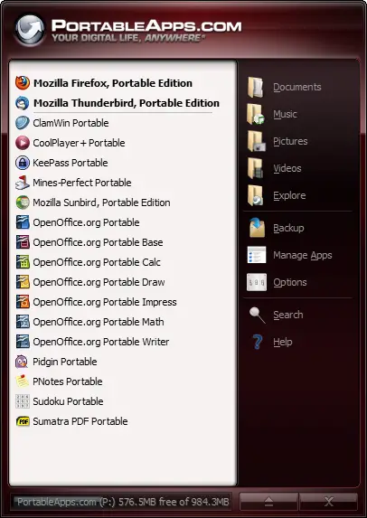
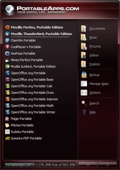
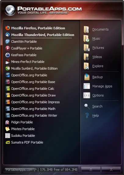
Working with our chief creative-type person, we've come up with a new default 'chrome' layer that's lighter and looks quite a bit more modern than our old one. Here's a quick look (click to zoom in and then you can navigate between them):


Helpful tip: You can middle-click the images to open them in new tabs to make it easy to switch back and forth between them quickly to see the differences.
The first two are the standard default theme that can be mixed to 16 million unique colors with a white or dark app area. This is the new red we'll be using as our primary color. The second two are a variant called 'Glow'. This is a fixed background (meaning it's a single color that can't be changed) but some folks prefer the look. The 5th is just an example of what adding in the textured rainbow look from the older theme looks like for comparison. It may help to look at the old images for reference as well:
Platform 2.0 String Translations Posted
As mentioned a couple days ago, we've got the strings posted, so now you can help translate the PortableApps.com Platform 2.0 to your language. We've included a few updated strings for the updater, app directory, fonts, categories and more as well as a few strings for the installer itself. We've gotten translations for several languages but still have a few dozen that need updated translations. And we'd *really* like to get as many as possible done before shipping the 2.0 Release Candidate to ensure they get as much testing as possible.
Updated 2.0 Schedule
As we're finishing up the theme changes tomorrow as well as the other couple OEM requests we mentioned previously, the release candidate will be out in the next couple days week instead of tonight. As a result, we're looking to next week for the 2.0 final release instead of later this week as we'll get a bit more buzz than releasing it just before Easter (holiday weekend for many folks), and it turns out more people than expected are away for school break or family holiday this week as well, so this coming week would be easier to get the word out and have the community help get the word out to as many users as possible. And it also means we don't have to cancel our own plans to spend this weekend with family.
So, please give the new themes a look and let us know what you'd prefer as your default. The sooner we get these done, the sooner we can get them in everyone's hands for final testing and review on multiple systems and monitors and then push out 2.0 Final. Also, don't forget that we'll be including lots of colors in both light and dark as well as including both the new cleaner chrome and the older beveled chrome for folks who prefer that style as well. So even if your favorite isn't selected, you'll still be able to switch to it with ease.
Thanks for your help in selecting the new themes, translating the platform and your patience as we finish up these last few issues getting to 2.0!
The impossible can become possible if you are awesome! - Rhino
- John T. Haller's blog
- Log in or register to post comments
Comments
I agree with Simeon
The silver icons make the new menu look better (matches better with the logo) but I personally prefer color.
Actually, to be honest, I think I can get used to the new look (after looking at the menu's icons for a minute or two, I can see where it's going) but I'd still keep my Windows 7 theme (which I'm currently using).
Ugh
Those icons don't match the theme in any way, shape or form. Please don't include them.
Red...
I don't know.. Red is just not doing it for may anymore. I've been using the semi-transparent Windows 7 theme (the blue one) and it's a winner in my book. From the default screens shown, though, I'd go with the "rainbow" image.
Pages