Greetings fellow portable-appers!
(UPDATE: PortableApps.com Platform 2.0 Beta 5 has been released, so now you can try out many of these features today.)
As we've had a lot going on both publicly and behind the scenes lately in the countdown to 2.0, I figured the best topic for my inaugural blog posting would be a preview of the upcoming 2.0 platform. For the new users, the PortableApps.com Platform is the glue that lets you tie all your apps together. It currently consists of the PortableApps.com Menu; which has the ability to install and uninstall apps as well as manage your icons, check your drive for errors and more; and the PortableApps.com Backup Utility which allows you to backup and restore your documents, portable app data (bookmarks, email, settings, etc) and your entire portable device. The 2.0 platform is adding an array of new features including a brand new theming engine, file associations, portable fonts, categories and other icon arrangement options, an integrated updater, platform extensions, FULL Unicode support and more. Today, we'll be exploring a few of the new features that will be appearing in 2.0, many of which will appear in Beta 5!
Read on for more details on PortableApps.com Platform 2.0...
PortableApps.com Updater - Keep All Your Apps Up To Date
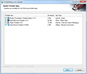
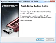
The next beta will see the first public appearance of the new PortableApps.com Updater. The updater can automatically check all your apps in PortableApps.com Format and let you know which are out of date. When out-of-date apps are found, you'll see a notification and list of them as you start the PortableApps.com Platform, at which point you can uncheck any you don't wish to update, click Cancel if you don't have the time to update right then, or click Next to have it automatically download and install all the updates. The PortableApps.com Updater works directly with the PortableApps.com Installers that all the apps are packed in so all the updates can install without prompting you for additional information, automatically installing the same options as before (additional languages, etc) and not reprompting you to agree to a license you've already agreed to (freeware, etc). A screenshot of the update prompt is shown below:
New Theming Engine, Over 30 Built-In Themes, And New Aero Theme
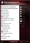
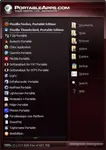
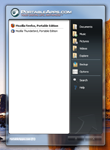
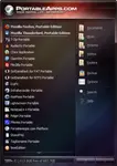
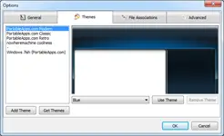
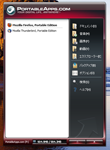
The next beta will also see what should be the final version of our new theming engine. This new theming engine makes customizing the look of the PortableApps.com Platform even easier than before and has a lot more functionality than the last beta. It has two built-in standard themes similar to the look of the current platform: PortableApps.com Light and PortableApps.com Dark. These have 15 included colors each, along with the abilty for the user to select their own custom color. The light version uses a standard white background on the app list with black text. The dark version uses a darker version that incorporates the color of the theme with white text. There is also a new aero theme that directly matches the look of your Windows Vista or Windows 7 aero theme coloring and blur. And all 3 built-in themes are available for themers to easily customize with a single image (see the rainbow theme) for simple customization. Check out the screenshots:
New Options Windows and Theme Selector
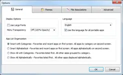
With all the new features and functionality, it made sense to introduce an improved way for users to be able to change options, pick themes and set other features within the platform. So, we've created an integrated options window with tab for general options, theme selection, file associations and advanced options. You can see the current incarnation below:
Full Unicode Support With 55 Translations (And Growing)
As PortableApps.com is the most popular portable software solution in the world, we have a ton of international users. So, we felt it was time to make the switch to full Unicode support. This enables us to support additional languages that we couldn't under the old ANSI platform (like Vietnamese and Serbian Cyrillic). It also allows the platform to run in the user's selected language regardless of the language Windows is in. That means that if you like your menu in Japanese or Korean or Chinese or Hebrew or Arabic, you can have your menu in your own language as you travel and use other people's PCs even if they're not in your own language.
Other 2.0-Related Updates
We've already begun posting updates in the countdown to 2.0. You've probably noticed the PA.c Format and PA.c Installer posted a few weeks ago. These include updates specifically for the new platform and updater, full unicode support, and an enhanced visual branding to match the new menu and website design. Just yesterday, we posted the PA.c Launcher 2.0, letting developers, publishers and advanced users make normal apps portable without writing any code.
2.0 Release Schedule
The next beta of the PortableApps.com Platform, beta 5, will be posted within about the next 10 days soon. We expect to be able to release the 2.0 final version later this year along with updates to the PortableApps.com website to increase community participation and enable better multilingual support. We'll be posting more as soon as it's available to our website, rss feed, twitter account and facebook page. So, stay tuned... the best is yet to come!
Best,
John T. Haller, head portable-apper
Subscribe to our RSS feed | Follow us on Twitter | Follow us on Facebook
- John T. Haller's blog
- Log in or register to post comments
Comments
please don't misunderstand me
please don't misunderstand me i love portableapps.com and GREATLY APPRECIATE THE WORK U GUYS DO!!!
but the visual side could be a bit cleener..
would be more appalling to many..
i re-skinned the beta version for my self.. take a look is a minimal skin for my minimal win setup..
but that logo is just soo out of place i tryed "reshack"-ing it no succes..:(
let me post a screenshot to show what im talking about http://postimage.org/image/2k3npqnqc/
[url=http://postimage.org/image/2k3npqnqc/full/][img]http://s4.postimage.org/...
[url=http://www.postimage.org/]image host[/url]
i hope somebody feels the same i do about the logo..
people like apple cause they keep it simple and clean nike is same ..
lets ad a 2011 feel to this app too maybe just logo and 8 pixel font portable apps under it next to it would be enough.. dont u feel?
hope i make seance and im not out of line just wish this product would get better more "pro" feel to it..;)
my best regards
peace
iD
Aero Theme
Hi! any new about the aero theme??
thank you guys
Pages