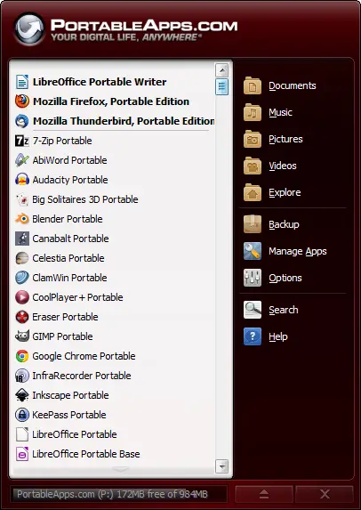
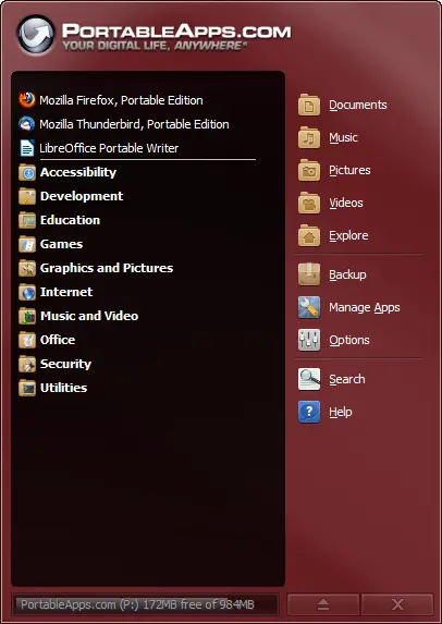
PortableApps.com is proud to announce the latest test release of our upcoming Platform (codename: Leo). 2.0 Pre-Release 1 is available for immediate download for testers and translators. This PR1 release introduces automated and customizable folders (aka categories) in the menu, our new theming engine with multiple chrome styles, the Portable App Directory app store for automatic download and installation of portable apps, find-as-you-type search to easily find apps in your ever-growing collection, an improved updater with better support for proxies, an improved options selection window, more-complete translations into more languages and lots more. This latest release represents a big update to the underpinnings of the platform on the road to 2.0. So, how about we start checking it out... (permalink)
Customizable App Organization With Automatic and Custom Folders
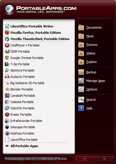
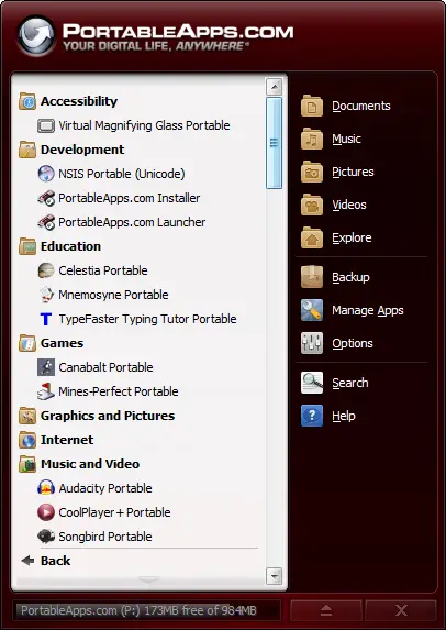
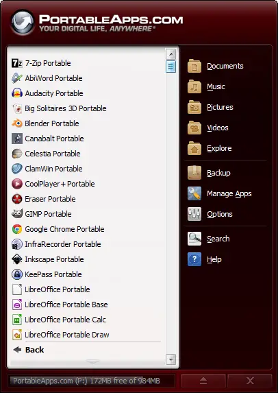
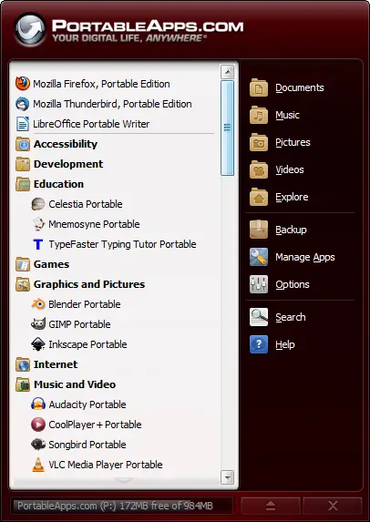
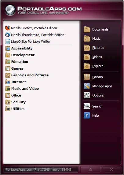
You asked for it, you got it. And then some. The ability to organize apps into folders is just the tip of the iceberg. You can combine automatic folders (all apps 'know' if they are an Internet app or an Office app and will show up in the appropriate folder), your own custom folders, favorites to pin apps at the top or to the first page and a 'smart' list ordered by the apps you use most. You get to decide how to organize your apps so you can easily get to them. Here's a preview:
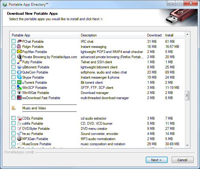
Portable App Directory™ - A Built-In Portable App Store
Now it's easier than ever to download, install and use the portable apps you want with the built-in app store. The Portable App Directory shows you an easy-to-navigate list of all the available apps you don't yet have organized by category. You check off the ones you'd like to install and it does the rest, just like our automated Updater. They'll even show up in the right categories in the menu when they're installed, all automatically.
New Themes and a New Theming Engine
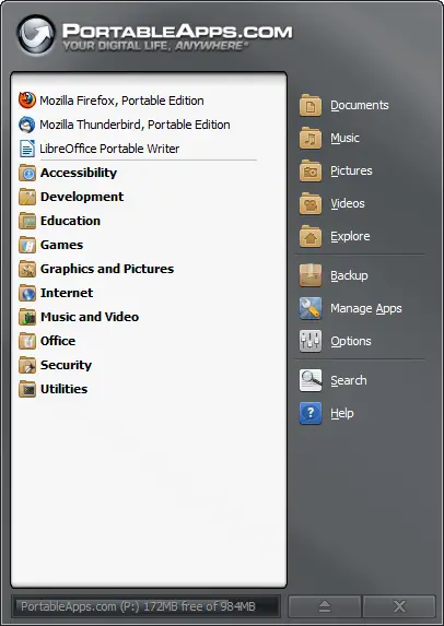
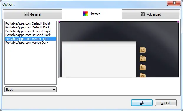
This release also sees the introduction of our new theming engine. With a choice of 6 chromes and 17 colors each, you've got a lot of choices in how you'd like the menu to look. From our classic beveled style, to our modern flat look to our Aerish theme that blends right in with Windows Vista and 7, you can easily pick the look you like. And in Pre-Release 2, you'll be able to add in custom themes as well.
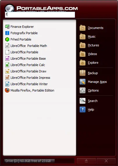
Find-As-You-Type to Quickly Search Your App List
In this release, you're now able to automatically filter the app list by typing a few letters of the name of the app you are looking for. With the menu displayed, you can just start typing (or type / to switch to find mode just like in Firefox). As you type, the app list is narrowed down to only apps that match what you've typed. You can hit enter to launch the first app in the list. Hitting escape or backspacing all the characters out and then once more with none entered will exit Find-As-You-Type mode and switch back to your normal app list. You can even hit the menu's hotkey (CTRL-ALT-SPACE) from any app to pop it up and just start typing to launch your app, all without a mouse.
Easy to Use Options Window
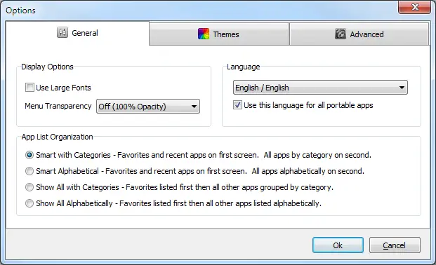
Customizing the PortableApps.com Platform to your liking is even easier with the organized Options window. You can alter the language, font size, transparency, automated language switching, app icon organization, change themes and more.
Improved PortableApps.com Updater - Keep All Your Apps Up To Date
The bundled PortableApps.com Updater has seen some nice usability improvements. It will automatically download the extra bits for online installers itself so you'll know exactly how much time is left. It's got improved translations. It automatically works with most proxies, even for online installers. There's even an option to have it automatically and silently check for app updates as you launch the platform. It's under Advanced Options, though it's disabled by default as the menu will minimize when it runs (a bug we're working on) as there is a bug preventing it from working properly and causing it to block platform updates. This option should be disabled at present. It will be fixed in the next pre-release.
Discussing The Pre-Release, Enhancements and Bug Reports
As there is much to discuss with this new release, we've separated out a few forum threads for discussing:
- 2.0 Pre-Release 1 bug reports
- Default app organization settings and "smart" list sorting
- Language updates and changes
- Version number change: keep 2.0, 1-2-5, Ubuntu-style 11.08, etc
- Portable Apps that have outdated installers and need an update to better work with the new app store
Donations - You Can Help Keep PortableApps.com Free!
With increased popularity comes increased costs for bandwidth and hosting. We're also heading to the open source convention in a couple weeks to teach other developers how to make their apps portable. Your donations are GREATLY appreciated and help make all this possible. Please become a PortableApps.com supporter today!
![]() - Please help support PortableApps.com's development and hosting
- Please help support PortableApps.com's development and hosting
The Road To 2.0
We'll be releasing additional pre-releases over the coming weeks. While termed a pre-release, this is definitely a beta and there are still some known bugs in this release as well as incomplete translation loading in many places. After too much feature creep in the original 2.0 work, we've paired it back significantly to make it easier to test and get the releases out faster. We'll be rolling out file associations, automated app shutdowns, portable fonts, caching the full app list between sessions and a few other features in addition to bug fixes and translation updates over the coming weeks. We've already completed about 1/2 the work needed for much of it and will post more soon.
Download Today
You can download the new test version from the download page. Get it today!
1.1 Update
An update to fix some initial bugs has been posted.





Comments
Congratulations on the release and a big thank-you!
I'll immediately start kicking the tires. I've already downloaded and will be installing any minute.
Thank you, John, and to all the others involved and working behind the scenes.
Yay!
Definitely worth the wait
Looks good
It looks good, but you know that already.
Started writing bugs down, but then I realized you got a forum topic for that. To the forum topic, then...
Yea! Thank You. I'll get it now.
Thank you for all that you do here. Portable apps have been very helpful and easy to use. The collection has grown greatly. Better apps and many useful tools.
Thanks to all that have converted them. Thank you for the many games that you have made available too.
Congratulations
Good to see it moving another step!
Concerns...
This is my first post, so please, if this is in the wrong section, move it.
Just installed PR1 and began playing. So far I like it. All but one little detail. I usually run a dark theme, like black on black. When I do, I end up with a BIG WHITE scroll bard down the middle of the interface. Can supply pic if it is not reproduce-able.
It would be nice to have the option of the old menu interface as well (no folders and such) just the scroll button on the bottom.
Great job everybody!
will add
You can select simple alpha ordering. The scrollbar will be able to be disabled in the next pre release as well.
scrollbar suck kills my theme!
i agree scroll-bar kills it!:(
this is my theme.. http://postimage.org/image/b3ud961w/
try imagine it with the fat ugly scrollbar in the middle...:( sucks..
and her is with the scrollbar:(((((((((((((
http://postimage.org/image/ipcv2p1g/
and as u can see the portable apps logo is also big an bulky.. not sexy enough..
it is 2011 and that heading screams 1995..:(
to loud ...:(
look at apple Nike etc.. nice simple minimal not in your face..
the logo is fine but the text next to it im sorry but LAME..
sorry to be negative i just love this app and i wish it would be cool to not just useful..
i really hope someone listens.. Jhon..? anyone...?
peace
iD
Didn't you read the comment
Didn't you read the comment you're replying to? John just said he would add an option to disable it.
i did! read it i just didnt
i did! read it i just didnt get it why is there in the first place...
in previous version was not necessary why now?
anyway cant wait til the option.. til that i use the old one..
i just hate that nice good things get bloated with options and slow down or become clunky..
im a minimalist..
anyhow..
"if u can take it away and it still works then that thing should have not been there"
simplistic thinking..;)
peace..
Terrific job!
I'm very impressed with the new platform - many thanks to all those who have contributed!
Cheers,
James
x
Yes! It IS there...
... not that I lost my faith, but it is good to see it released finally.
I just played a little and am quite pleased with the new features. I have some comments, won't call most of them bugs but suggestion. I will post them in the bugs topic nevertheless.
Thanks and congratulations, great job for now.
Wow
Thanks John for this. I am eager to try it.
I hope the donations go up from now on.
After using it a bit I am quite impressed with the folders.
But I am a bit unhappy with the search bar location. Imho it would be nicer to have it at the bottom over the free-space-bar or so.
May Move Search
I'm not married to search where it is. It was a last-minute addition, so the design isn't as refined as the categories, for instance.
Last row
I think the last row where "All Portable Apps" goes would be a good spot. I think it would look in place there.
Agreed
I agree that it be better at the bottom.
yes
That would be even better.
Disagreed
As the search function narrows the app list to a smaller selection where one hopefully will be able to select an entry with the cursor keys once, I find it not very intuive to go up to select the entries, last matching first. Or to go down to start at the top of the list. If the list will be reverse ordered it still seems odd as the first matches are at the bottom. Not what you usually expect in an ordered list.
But its just a minor issue. I am very pleased that my most awaited feature was added and does function rather comfortably.
the top is nice it is like spotlight on mac..
is good where it is now!! but the logo should go ...
i mean logo should be modernized so is not as chunky as it is now..
Agreed
I'd hate to toss some more meatloaf on your already-caked platter, but, since it seems like going flat is the new way to go, the old logo would look better than the new one.
old logo? im curious..?
old logo? im curious..? link?
i think the logo is fine just the text is bulky and is like made in 1995..
need to be more 2011..
in my opinion..
Thanks, John
Taking a look at the Graphics folder, I see how you have set up the structure.
I'm curious to see how a custom theme folder structure will be set up for the custom themes. I would hope that all of the new graphics are fair game for customization! Provided there aren't any big changes in packaging, I should be able to rework my PAM Theme Builder fairly quickly, and I'd like to have it ready soon after PR2.

Any info would be appreciated...
Thanks
Thanks a lot
Thanks a lot John, its nice to see the platform finally released.
Similar
It won't be changing too much. I just wanted to get the bits that were part of the platform itself (and will be utilized by many downloadable themes) in a central location.
Excellent work John & team...
Though I haven't had chance to d/l yet I can see I'm in for a treat
I still think you should take my advice though John, stop giving dates!It's nice to have an idea of a release date, but you seem to have a habit of missing them! Oops! And it's. always nice to be surprised when a new release comes out too. At least that way you'd get no bad criticism for missing dates.
I know this sounds a bit negative, but I'm really only trying to help
All the best and well done for the great work, it was worth the wait.
Thanks
EDIT: I tried to d/l v2pr1 using my phone but apparently iits not supported
2.0 Features
Good to see that progress is being made but I shall be sticking with the original 2.0 Beta until such time as the desktop icon is incorporated.
Upgrade
As this is the successor to the beta 5 release and beta 5 doesn't have a desktop icon either, there's no reason not to upgrade and get all the new features.
Looking Good
Have tried the new version and I really like the App Store and folder functions.
Congrats
Nice to see a tangible result. I will certainly be using this and the following updates because after all the hard work (and the long wait) I am sure there are very few bugs.
Portable apps is a fine application. I have introduced many of my friends to this and they are all, without exception, very impressed. Well done.
Still not usable for me
I really like the work from Jon and the other PortableApps supporter. The platform itself is not usable at all. There are some good improvements like the updater, but all in all the interface is clumsy and very uncomfortable to use. I feel very sorry, that Jon wasn't open to welcome savantage some years ago. He is the programmer of Asuite which has still the best interface for me. He was willing to support PortableApps with Asuite. Now it is an dead project, but still the best platform. Sorry for the clear words. Here are some points which have to improve from my perspective:
1. The interface: I need an unobtrusive small and fast menu, which can be easily activeated. Best concepts come from Launchy(just a searchbar, activated by shortcuts) and PStart, Asuite (simply, plain folder menu, activated at the screen borders).
2. The long Name "Program-name Portable" is nonfunctional. In addition there use spaces which can make problems with scripts. If you scan a menu and it is harder to distinguish. Why not simply user a big "P" to differentiate it.
3. Same problem with the folder there the programs are hosted. They have to be named "Program-name Portable". Otherwise the update won't work.
4. Not flexible enough to add other programs. Why is there not an drag and drop support, to add my own programs.
5. There are all the individual Startoptions?
I know Jon is spending a lot of time. I really appreciate his work and commitment. But from my perspective the platform is going the wrong way . It is focused to support only programs developed here. I would like to see a more flexible and open platform. So far I can't recommend this project to my users.
Uh...
Unless your users are advanced users, most of your problems won't affect them. And regarding #4 - There is drag and drop support. From the file structure and not the menu, yes, but you seem to be using the file structure a lot anyway. Drag say...my cpu-z folder in by the other apps, and the icon shows up in the menu.
Furthermore: Regarding point 4
I haven't started using PAM 2.x yet since I was waiting for folders and haven't had a chance to download PR1 yet. However, in PAM 1.x (and I'm pretty certain the same goes for PAM 2.x), there is a PortableApps folder on your drive where all the apps are stored (eg. X:\PortableApps). If you simply install a new (non-PAc) portable app in that folder with the launcher as an executable inside a directory inside the PortableApps directory, it'll appear in the menu when the menu is restarted. There's also a way to get this to work with launchers that aren't executable.As an example: For ejectUSB I have the following folder structure:
+X:\
|+PortableApps\
|+ejectUSB\
|-ejectUSB.exe.
|-...
Regarding points 1 and 2
1. When the menu starts using caching (as we're assured would be available in PR2), it should become much faster.
2. I'm not certain (see this post of mine: https://portableapps.com/news/2011-07-19_-_portableapps.com_platform_2.0...). But if I'm not mistaken it is already possible to rename apps.
2.2. To avoid problems with scripts, it should be possible to simply rename the app outside the platform (again see https://portableapps.com/news/2011-07-19_-_portableapps.com_platform_2.0...).
GREAT!
I've been anticipating this for a long time... from the first mentions last July then again around December and finally in May when I thought it was just around the corner... but now it's really here! Over the last year I've argued with myself whether I should "join" the ball-busters (using every opportunity to complain about the lack of progress) or the ass-kissers (jumping to the defense of the developers every chance they got) and finally I just decided to keep my mouth shut and wait it out... and I'm happy that I did
What a great release.... and with a few surprises even! I've been using the Beta5 all along so I've gotten used to the auto-update and love it... I knew about the upcoming "Portable App Directory™" and the category/folder view... but I had no idea you were incorporating the Find-As-You-Type search, which I (and probably a bunch of others) have been asking for/suggesting in the forums... very nice indeed
All I can say is thanks a lot to everyone involved (John & Co.) and I'm looking forward to the shorter (Chrome-style) development cycle from now on!
Off to the bug/suggestion forum...
Congratulations
Congratulations on the release, finally we will get to see all the work you put into improving the platform.
Beta 5 Seemed better
The menu is a little confusing to adjust to at first. It kinda reminds me of the Win XP menu. Favs at top, most recent under, then everything else in a small clustered section after a click or two.
I miss some of the themes that got removed like RainbowDark.
The new icons look okay, but can there be options to opt out back to the Win7 like icons so they match the folder icons?
My Log-Book 20.07.2011
Version From: 20.07.2011
Thank For You Great Job!
Greeting From germany
*My English its Bad, Sorry!
Thanks - Small German translation hint
First of all thank you so much for your effort! The new platform looks great!
When loading the Updater, I found out that on the loading splash screen (I use the platform in German) it says "Suche auf nach aktualisierten", whereas it should actually say "Suche nach Aktualisierungen". Just a small hint...
Thanks again and good luck with the future process of the platform.
I am aware of this, thanks
I am aware of this, thanks for the hints. There are some bugs on how the locale file is used. I think a complete error check has to be done once the parsing is right or errors in the locale file are found. The problem with overly long translation might be corrected, but only to a certain point. Some translations can not be shortend further and the GUI should cope with that in the future.
Help on trnaslation is always welcome, have a look at the german translation discussion.
Very close to a masterpiece
Definitely worth the wait [2]
I'm surprised with the PAc's App Store-like built in app.
Thank you very much for this!
Carbon Theme...
I've just tried the new PAP v2pr1.1 and it's impressive. I read about the bugs beforehand and experienced the platform auto update bug as well. Though if you close the window which says software update complete before proceeding with the update then it seems to work better.
Also stuff left behind from previous version. Not sure which files are necessary.
Scroll bar shows icons and sometimes a part of the platform graphic also showed on moving mouse back and forward.
App Store showed AniFX Portable in Games category.
I like the way you added various types for the categories, my fave is Favourites first then Categories.
Now for couple feature requests:
1. Would like to see option to show menu in similar way to ASuite, PStart, Classic windows menu, etc. when click on systray icon.
2. Right click should show more options like the Manage Apps and Options menu's.
3. I would also like to have the option to search a user specified folder for apps. This way I could keep my non-PA.c apps seperate.
Also, the in built themes are a bit strange! I mean, the colours don't actually match the colours stated.
eg.
Orange is Brown
Yellow is like a Lime Green
Gold is pretty much Green
Though I like this last one! Well they're all ok but they just don't really match my expectation of the description!
Talking of Theming, can I use my old Apart Carbon Theme for v2 still? Where would I put the files?
Thanks for a fantastic update, can't wait to see future versions
Congrats, John. Awesome update !!!
This really looks good and was worth the wait. I installed the 1.1 release over the top of beta 5 and everything is working. Loads faster for me. There is some minor problems with the scroll bar graphics and the colors are a little off(as someone pointed out).
I noticed that when a white color is selected you have white text on the white background in the right side folder area, until you mouse over those folders.
Organization #1 is my favorite.
On App list organization #3, how is the order of the favorites determined? Seems very random. I thought at first it was by usage but don't think so. Favorites should be alphabetically for this option. Is there a way to sort them?
I know there is some feature creep but user defined categories would be sweet.
App list organisation #3. I
App list organisation #3.
I agree with robertrock on this I couldn't figure out the order either. It needs to be a choice of alphabetical or usage. I prefer alpha sorting personally.
Hopefully this'll make it into Johns todo list
Sort Bug
That's a big in ordering when set in Show All By Category. It should be alphabetical. I missed that for our first bug-fix update 12 hours ago. It'll be fixed in the next bug-fix update (probably tomorrow).
Thx for that release
One suggestion for "Portable App Directory™ - A Built-In Portable App Store".
I need to display a column where i can see the license of software. That would be great.
I totally agree.
I totally agree. That would be nice, as I prefer open source licenses.
Option Coming
There will be an option shortly to allow you to filter out freeware and only show open source software. It will be a checkbox in the Advanced Options window of the platform.
I'll look into some sort of indicator in the page itself, too for those who are interested. Maybe a * next to open source as an advanced option for users who want to see everything and easily see what is open and what is not.
GREAT JOB!!! Great to see the New Realease!!! Love the Folders!
Its Great to see the new release!!! I have been waiting for those folders for a long time and I love them!!! (I always hated scrolling down the huge list to find the app I was looking for ... if it wasn't in my favorites)
Also, kudos to the person who decided to allow the users to create their own categories/folders. I Love the search feature, too.
GREAT JOB to ALL who worked on the new release!!!
Automatic Update did not work for me
This morning I let the portableapps.com platform try to update itself. It complained about a file that it could not update so I tried to cancel the installation. It did not cancel. The installation process was hung. The way I fixed this problem was to kill the installation process, download the platform executable, and manually update. It works now. I would tell you which file it was complaining about but I cannot find an installation log.
status on the "official" usb drives going on sale??
Can you give any kind of updates on the rumored availability of branded PA drives??
Congratulations
Congratulations to the team for the outstanding work you have done to exit this interface very accomplished for a RC version, but also praise for the work you do every day to help with the development of new portable applications.
Regards
Raymond Team of Mathon French
some "Download New Portable Apps" features I'd like
1)progressive search
2)truly numeric sort in Download/Install size columns
3)pauseable/resumeable individual downloads
4)Outlook-style sorts, i.e. click on Download columns, it groups by size
5)show versions, allow downloading of older versions
6)show already downloaded items with version
7)show work list, i.e. when you click on an item to download, add it to a list of items, showing total download size and estimated time
8)postpone download until online
9)show more info on apps when you click on them (don't launch a browser)
Thanks.
I agree
Most, if not all, of these are good ideas to some degree.
I think there should definitely be a way to pause/resume individual update downloads (and move to the next or back to a previous update in the queue) or at the very minimum a way to pause/resume the current update download (but not allow any type of moving forward/backwards in the update queue - the whole queue of updates would be paused where you are at until you resume).
Not good themes(more themes please, 10-20 were good)
Yes, on 2.0 Pre-Release 1 are not good themes, only rubbish.
I hope the bugs and ... will be fixed in the final realease and all words will be perfectly translated, no englich words, that i cant understand for example: expand categories by default(in every language i read this in english, I think it must be translated in the language which i need)
mfg Basti
Translations
Some bits don't load translations yet. Some things like "Expand categories by default" were added in after the last set of translations we did so will be completed in the coming weeks.
Themes are a work in progress and will be tweaked over the coming weeks.
.
...
Can use ASuite theme-sheets
Can use ASuite theme-sheets
New Platform
Just downloaded the new platform and it's fantastic. I love the simplicity and the user interface is so much cleaner. I haven't found any issues with it as of yet but, from what U have seen and used I like it a lot. Keep up the great work.
[Moved from a new thread into this thread - mod Chris]
My suggestion: add a calendar.
My suggestion: add a calendar. See the image http://goo.gl/kHD6J
Seriously?
I think it's quite fair to say that that will never happen in the Platform. With an extension system it might be possible eventually, but that's far from a high priority at the moment.
Thanks.
Thanks for the reply. I just made a suggestion.
My 2
On the built-in theme system:
You currently have ini files in separate folders named like the Chrome files.
The text colors are locked into those ini files.
You only have a few set colors for the background.
A better approach:
Have a single ini file for the built-in themes.
The selections in the Options>Themes would write to the ini.
In the Options>Themes tab, have the following selectable options:
Chrome
Default Light
Default Dark
Beveled Light
Beveled Dark
Aerish Light
Aerish Dark
None
Background
Color (use a color picker) (add checkbox for none)
Image (use a file browser) (add checkbox for none)
Text Color
Apps (use a color picker)
Folders (use a color picker)
Drive Space (use a color picker)
This would allow users to change the look very easily. You could even have some preset color/chrome combos to get people started.
"Themes"
With, I think, "Themes" which are preset combinations. Perhaps calling it "preset" would end up being better, depending on how themes end up being distributed.
In Progress
The themes are still a work in progress. Our designer's time has been a bit limited, but we'll be adding some more features into the future builds. For one, themes will be able to have custom text colors based on the color you select (in addition to a default, of course). We have a color picker already built for custom background colors. I hadn't considered doing the same for the app list and right-hand icons, but it would make sense.
The things I mentioned
The things I mentioned are very similar to the code I use in PATB. Since I work in Lazarus, it's not too different from the Delphi you use. I'll play around with the source from 2.0PR1 and see if I can come up with something that works for the Options dialog, maybe it will be helpful for you.
Will the Portable App
Will the Portable App Directory show only apps you don't have in the future? (ie hide installed applications)
And FINALLY!
It Does
It only shows apps that are not currently installed. Unless you install the app to a nonstandard directory (example AbiWordPortableMyCustomPath) in which case the platform won't associate it with AbiWordPortable so it won't know it's installed to filter out from the full app list or to update it.
Doesn't just show noninstalled apps
When I do a program update, it does not seem to be filtering out the already installed ones. Since I installed Portable Apps itself to a nonstandard directory, I would guess that is why. i.e. PortableApss is installed to c:\portapps2 for testing purposes and although Abiword is installed it still shows up in the Apps list.
Totally Awesome!
Totally Awesome! I love it!
Seems pretty stable so far.
If I do find any bugs I'll make sure and report them.
Congratulations on the RC1 Release...
Congratulations on the RC1 release...but I'm not happy at all.
I was intending going out this weekend, but can now see myself sitting in front of my laptop giving this RC1 a good grilling - just as well the wife and kids are away for the weekend!
I've moaned about the lack of a P2 RC previously, but my hats off to you guys for a big step forward. Keep the updates bitesized and regular from now on; keeps us happy and saves you guys from getting indigestion.
Well done.
Thanks, We Are
Thanks for the interesting take on the weekend. But go outside and enjoy some summer.
We are doing much more bite-sized updates. We did one just 5 hours after release (Pre-Release 1.1) with 10 nice bug fixes. Another (Pre-Release 1.2) will be coming either today or tomorrow with a similar set of bug fixes. We're prioritizing bug fixes and translation updates and completion to get things nice and stable. We'll add the other new features in Pre-Release 2 but will base its development on the time we spend bug fixing and updating translation so we won't go announcing dates before they are stabilized.
Hide Desktop Icons!
May i ask:
Can you put the hide desktop icons option back on because i loved the function!
Thank You!
Yup
It still works if you edit the INI yourself. We just don't have it showing up in the Options window yet. It will in the next bug-fix release (probably tomorrow).
I like it...muchly...but ONE QUESTION
Still having a look around RC1, but I like what I see.
Like the way you can choose App updates and new apps.
ONE QUESTION: Why is jportable not in the Portable App Directory list? Need this for LibreOffice, but have to download and install outside of PortableApps platform. Checked the apps list twice, definitely didn't see it there. Will download manually, but thought I would flag / query this.
Nice job...very nice job. Like the way that once an app is installed it doesn't appear in the Portable App Directory list, neat.
Worth the wait
Looks good so far. I've only used it about 5 seconds though
I noticed you don't update/delete Autorun.inf. If you do a PR2, it might help to have the installer delete it (except for me, since all the library PCs still have autorun enabled).
And caching? No caching?
Don't know if it's been mentioned, but the icons in the context menu are ugly on XP when you hover over them (both classic and Luna)
And Apple throws a fit when you use "App Store"
Caching Coming
Caching is coming but not yet complete. The underpinnings are nearly done for it. It'll matter more for non-PAF apps than PAF apps.
I'll have a look at the context icons in XP. I hadn't checked that out yet.
Portable App Directory
I would stick with the phrase "App Directory" or "Portable App Directory" to avoid those legal issues. It's phrase is already being used to refer to the application list, so why not keep it simple?
Naw
I'm not taking about the main name "Portable App Directory" but people are referring to it as "App Store" or "Portable App Store" in addition to it. So I suggested playing it safe.
The last thing anyone needs is Apple falling on PortableApps.com
Right
I agree. That's what I'm saying too, don't have a secondary name for it.
Nice how Apple's giving the
Nice how Apple's giving the whole world a message that they own the name "App Store" without even trademarking it.
mmm... I think they do own the trademark
Microsoft even sued them over it:
http://www.informationweek.com/news/hardware/desktop/229000550
EDIT: Here's a better site: http://www.apple.com/legal/trademark/appletmlist.html
PAAPS 2.0 PR1
Great Job! Great Team! GREAT PLATFORM!
JTH, you are so appreciated...
...There is a lot of work in everything you do. I suspect you run on about an hour of sleep each day. I think you need a body guard. We really don't want to lose you and all the nifty things you dream up and produce.
Really, thanks so much.
R
Thank you and 2 suggestions
Thanks on the update. I do have one suggestion and one suggestion/request.
Initial presentation
I was distracted and puzzled by the initial setup which is "Smart with categories". I could not find my Thunderbird, which sits at the end of my list. And clicking on All Portable Apps lists them by category. It's only after I had played around with all the menus that I discovered my way to the old setup. My suggestion would be to either set up a rotation between the three forms (à la Thunderbird), or to show the "Show all with categories" at the initial setup. That way, new users to PortableApps would easily find their way around.
Shortcut
Former shortcut (in beta 5) was windows-alt-space. It didn't interfere with Word's "remove formatting" and "hard space" commands.
Yes, but the old hotkey
Yes, but the old hotkey didn't work on Windows 7.
scrolbar suck kills my theme!
Of course the scrollbar should be themable
I'm sure it's not intended to be left that way in the final release. Also, if you read earlier threads, you will know that the scrollbar will be able to be disabled in a future PR.
What?? You must not have enough apps yet!
When you have over 100+ apps (most of them are nonessentials, of course), how else can you quickly move around without a scrollbar? Right now, I must resort to using either the arrow keys (keypad) or the wheel (mouse). Yuck!
Please keep the scroll bar. I think it looks rather nice.
No need
Why scroll, when you can type-to-find what you need. That virtually makes scrolling obsolete.
agreeed!!!!!
Pages