PortableApps.com is proud to announce the latest test release of our upcoming Platform (codename: Leo). 2.0 Pre-Release 1 is available for immediate download for testers and translators. This PR1 release introduces automated and customizable folders (aka categories) in the menu, our new theming engine with multiple chrome styles, the Portable App Directory app store for automatic download and installation of portable apps, find-as-you-type search to easily find apps in your ever-growing collection, an improved updater with better support for proxies, an improved options selection window, more-complete translations into more languages and lots more. This latest release represents a big update to the underpinnings of the platform on the road to 2.0. So, how about we start checking it out... (permalink)
Customizable App Organization With Automatic and Custom Folders
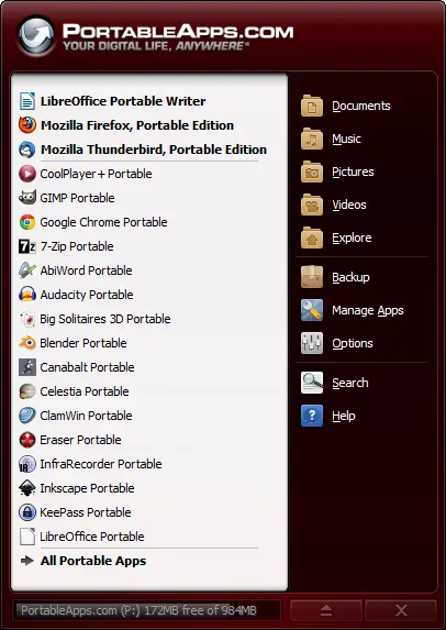
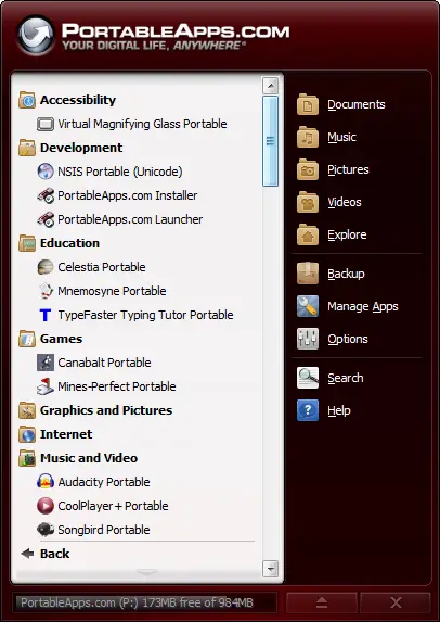
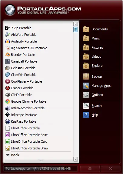
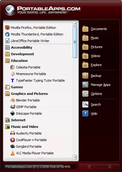
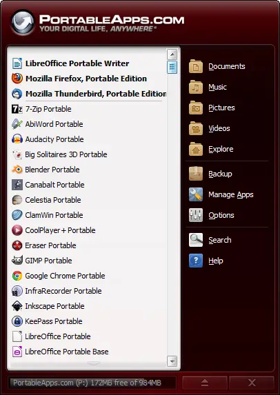
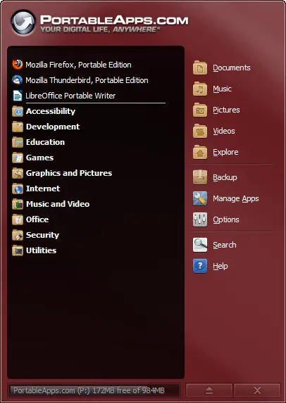
You asked for it, you got it. And then some. The ability to organize apps into folders is just the tip of the iceberg. You can combine automatic folders (all apps 'know' if they are an Internet app or an Office app and will show up in the appropriate folder), your own custom folders, favorites to pin apps at the top or to the first page and a 'smart' list ordered by the apps you use most. You get to decide how to organize your apps so you can easily get to them. Here's a preview:
Portable App Directory™ - A Built-In Portable App Store
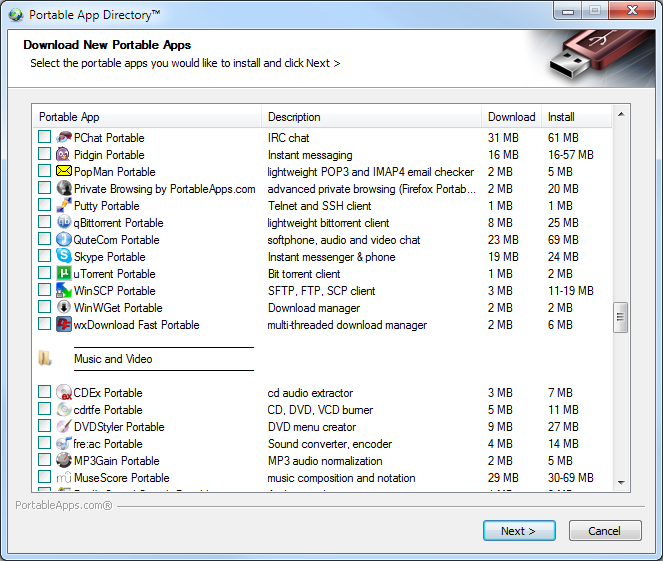
Now it's easier than ever to download, install and use the portable apps you want with the built-in app store. The Portable App Directory shows you an easy-to-navigate list of all the available apps you don't yet have organized by category. You check off the ones you'd like to install and it does the rest, just like our automated Updater. They'll even show up in the right categories in the menu when they're installed, all automatically.
New Themes and a New Theming Engine
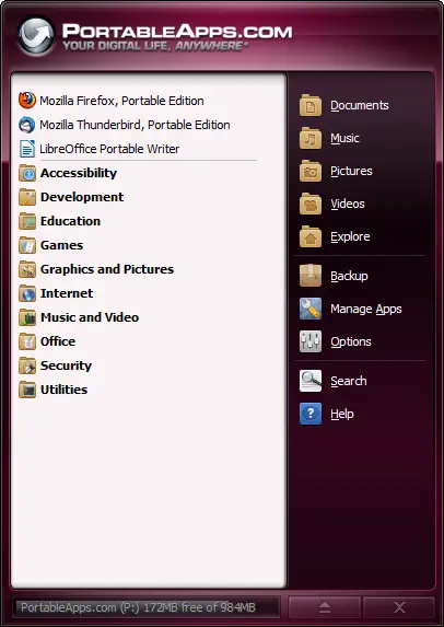
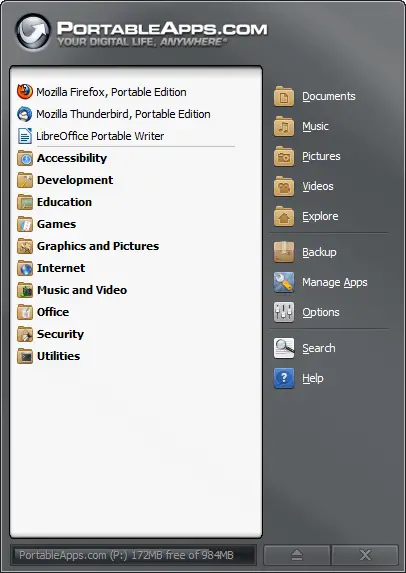
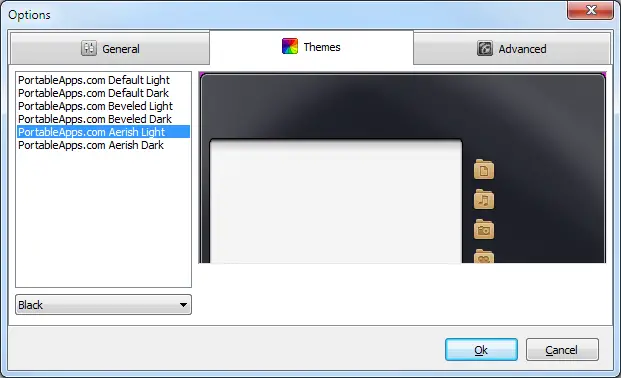
This release also sees the introduction of our new theming engine. With a choice of 6 chromes and 17 colors each, you've got a lot of choices in how you'd like the menu to look. From our classic beveled style, to our modern flat look to our Aerish theme that blends right in with Windows Vista and 7, you can easily pick the look you like. And in Pre-Release 2, you'll be able to add in custom themes as well.
Find-As-You-Type to Quickly Search Your App List
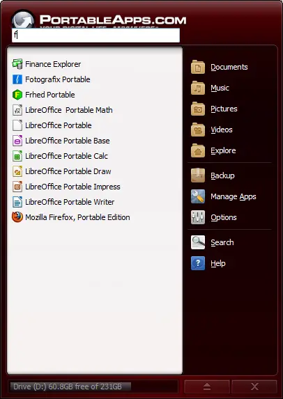
In this release, you're now able to automatically filter the app list by typing a few letters of the name of the app you are looking for. With the menu displayed, you can just start typing (or type / to switch to find mode just like in Firefox). As you type, the app list is narrowed down to only apps that match what you've typed. You can hit enter to launch the first app in the list. Hitting escape or backspacing all the characters out and then once more with none entered will exit Find-As-You-Type mode and switch back to your normal app list. You can even hit the menu's hotkey (CTRL-ALT-SPACE) from any app to pop it up and just start typing to launch your app, all without a mouse.
Easy to Use Options Window
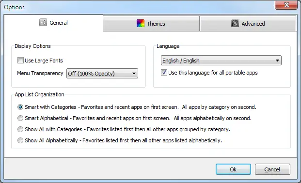
Customizing the PortableApps.com Platform to your liking is even easier with the organized Options window. You can alter the language, font size, transparency, automated language switching, app icon organization, change themes and more.
Improved PortableApps.com Updater - Keep All Your Apps Up To Date
The bundled PortableApps.com Updater has seen some nice usability improvements. It will automatically download the extra bits for online installers itself so you'll know exactly how much time is left. It's got improved translations. It automatically works with most proxies, even for online installers. There's even an option to have it automatically and silently check for app updates as you launch the platform. It's under Advanced Options, though it's disabled by default as the menu will minimize when it runs (a bug we're working on) as there is a bug preventing it from working properly and causing it to block platform updates. This option should be disabled at present. It will be fixed in the next pre-release.
Discussing The Pre-Release, Enhancements and Bug Reports
As there is much to discuss with this new release, we've separated out a few forum threads for discussing:
- 2.0 Pre-Release 1 bug reports
- Default app organization settings and "smart" list sorting
- Language updates and changes
- Version number change: keep 2.0, 1-2-5, Ubuntu-style 11.08, etc
- Portable Apps that have outdated installers and need an update to better work with the new app store
Donations - You Can Help Keep PortableApps.com Free!
With increased popularity comes increased costs for bandwidth and hosting. We're also heading to the open source convention in a couple weeks to teach other developers how to make their apps portable. Your donations are GREATLY appreciated and help make all this possible. Please become a PortableApps.com supporter today!
![]() - Please help support PortableApps.com's development and hosting
- Please help support PortableApps.com's development and hosting
The Road To 2.0
We'll be releasing additional pre-releases over the coming weeks. While termed a pre-release, this is definitely a beta and there are still some known bugs in this release as well as incomplete translation loading in many places. After too much feature creep in the original 2.0 work, we've paired it back significantly to make it easier to test and get the releases out faster. We'll be rolling out file associations, automated app shutdowns, portable fonts, caching the full app list between sessions and a few other features in addition to bug fixes and translation updates over the coming weeks. We've already completed about 1/2 the work needed for much of it and will post more soon.
Download Today
You can download the new test version from the download page. Get it today!
1.1 Update
An update to fix some initial bugs has been posted.





Comments
Backwards Compatibility... ;)
For older people like me who might not remember exactly what that utility was called, and have a hard time using the touch pad and the arrow, the scroll bar is a welcome addition.
No, not everyone will like it, sounds like there will soon be an option to turn it on or off.
Personally, I have no time or need for themes, I just need/want functionality.
Great job team!
Please, please bring "Refresh app icons" back!!!
(-) Please, please bring Refresh app icons (the one from Manage Apps context menu) back!!!
(-) Still predefined shortcut-icons to: Music/Videos/Photos
Cannot add or change those. Predefined thingis iz bad!
(+) yaay! finaly categories to sort up the mess
refresh app list
Its been moved. Now you can rightclick on an entry and hit refresh. in my opinion easier to access.
Don't think it should be
Don't think it should be there! It's not app specific its a general command and was already in the right place in manage apps. Its just unnecessarily bloating a context menu.
I agree
I believe that Refresh and Show Hidden Icons don't belong in there. Also, Hide should be moved to stay with Favorite and Start automatically.
It's OK, I forgot about
It's OK, I forgot about r-click menu.
Wow very nice and cool :)
I just wanted to say that I have install this latest version and started playing around with it. So far it is a great upgrade to the previous version. This is getting better every time. You guys are doing a superb job and I am sure thousands are going to enjoy this latest version.
I am happy that I came across this site a few years ago.
Once again well done for all your hard work. I already promote you in my website and blog with pleasure.
Thank you
Still slow to open
I thought it was being recoded to open more quickly (from a file)? I was expecting it to be almost instant but I'm still seeing the progress bar as it loads up.
Please bring back all of the previous skins! I had a diagonal rainbow style before - cant remember the name.
The new "get more apps" is interesting but it needs the facility to right click an entry and go to the applications home page. I personally don't install apps based on just the name, I want at least a description and preferably screenshots - which is only ever going to be possible by browsing a web page.
+1 to links to App Home pages
That's a good idea; although you could just go to the PA.c Applications page for now.
Agree -- include easy way to go to app page
See subject
Am I missing the point here?
Am I missing the point here? Surely the primary site for app details / descriptions is this site? I think having a single site providing the majority of apps is much more preferable.
I used to religiously record the original site that I got a portable app from. I don't bother anymore. Just keep a mental note of those not hosted by PortableApps.com otherwise just come to this site.
I used to do the same for installed apps, but gave up and simply went to something like Filehippo.com. Much easier to remember one site than a couple of dozen.
Let me explain
Here is my understanding of what the suggestion was...
When you click on "Manage Apps" and then click on "Get More Apps...", the "Portable App Directory" window opens up. The suggestion was that you could right-click on a portable app entry in the directory and go to the application's web page. Currently, when you right-click on an entry in the directory, you get a context menu with Check all, Uncheck all, Select all, and Unselect all. Added to those options could be "Go to this app's page on PortableApps.com" or something along those lines.
Simpler option
Nah, just hyperlink each app name in the list to it's corresponding page here at PA.c.
Besides, the right-click there isn't specific to the selection, it's global to the whole window.
(P.S. Is there a purpose to Select All? I don't see one...)
Yes
Yeah, having the listing itself be a link to the app page on PortableApps.com would be even better, but the point is to have some link to the app page.
And no, I don't see how or why one would use the "Select all" option, outside of maybe copying (CTRL-C) the list of apps in the directory.
You're expecting the Platform
You're expecting the Platform to load 60 or so apps instantly?
Yes, and I've been writing in
Yes, and I've been writing in Delphi ever since version 4.0 so I know its possible. Simply check through all the application sub-folders once and extract all the details necessary to format the menu to a file and icon database. From then on displaying the menu is a breeze (you'll need the facility to refresh that data when an app is added or removed of course).
You're talking about a
You're talking about a caching system, which isn't implemented yet.
Why isn't unicode used in the all dialogs?
Hello,
1. I tried to download new applications within this software. This program received a list of the available applications. There were no Russian letters in this list, only '?'-characters (I set language Russian in the options, my OS is in German). I hope you can correct it.
2. The application PStart allow to create new categories in other categories. It could considerably improve the menu structure.
Best regards
Alex
in my test is working for
in my test is working for unicode character.
see : http://imageshack.us/photo/my-images/98/snag0002k.png/
Best Update Ever!
Fantastic work! This is great!
My only gripe is with the
My only complaint is with the scroll bar. It displays fine under Windows XP but glitches under Windows 7 64-bit.
I am more than delighted to see PR1, and if I was a woman, I'd have John's babies.
thanks!!!!!!!!!!
u r the best site!!!! i am using ur apps all the time!!!
BTW if there are more people who like PortableApps.com - like that page(rss from this site straight to your Facebook!
http://www.facebook.com/pages/PortableAppscom/215568788458306?sk=wall
~ ~ update immediately!! ~ ~
Large app downloads
Great job, love the new version.
One question though, on the larger apps, Open Office and Libre Office, the download hangs. On OO it gets to 5kb from finishing and appears to lose the connection. I'm assuming something similar for Libre. Is this a network glitch?
WIN + ALT + SPACE?
Hi!, thanks for this release, it's just what I wanted!
But I wanna know why the global key WinKey + Alt + space (some don't know about it :P, it's to show up the menu) it's not working anymore! :'(...
2nd
Just tried it, no go
CTRL-ALT-SPACE
As stated in the release announcement, it's now ctrl-alt-space. WIN is not supposed to be used by apps and will not properly associate on many systems.
I missed that
Thanks.
Also was there going to be file association in the official 2.0? I can't remember.
Read Man
When did you stop reading, man? "We'll be rolling out file associations, automated app shutdowns, portable fonts and a few other features in addition to bug fixes and translation updates over the coming weeks. We've already completed about 1/2 the work needed for much of it and will post more soon."
File associations, automated
File associations, automated shutdowns and portable fonts. Looking forward to those.
In the meantime I'm just using Coffee with the Start Automatically option to give me file associations under the RC1 platform. Works a treat. It's an understatement to say that you've moved the platform on leaps and bounds John.
I'm probably self-promoting,
I'm probably self-promoting, but I would have said this regardless of whether or not I took over development for this app.
Coffee is a rebranded copy of C.A.F.É. Mod, created over a year ago. Since then, C.A.F.É. Mod has become ranamed into eXpresso, which contains new features and bug fixes.
Thanks for heads up!
@Glaxon: thanks for the heads up on eXpresso. I'll give that a look.
CTRL-ALT-SPACE
Thanks for that!, You've done a GREAT job with this release

Sounds good though it still
Sounds good though it still lacks a few features I'd like to see.
I'd like to make the platform look under Program Files instead of PortableApps though it's not a necessity.
I'd also like to add apps that aren't "portableapps" to the launcher but I want to manually specify these (I remember doing something like this before but it detected multiple executables for one program and listed them all. I also have a batch file I'd like to add that I run on one of my home machines. Though it's not really a portable application I'd like to run it as one (the batch file runs a sync program that backs up my portable apps and will soon enough also backup some other data from my SD card.
Finally, it appears the platform still includes all the translations. I only speak English so I really don't care to have a bunch of extra translations taking up space (I realize it's not a lot but still). [If you want to move this comment to a more appropriate spot feel free to do so.]
I agree...
When you install an app (including the platform and updates) and you're asked to pick a language that should be the only language installed.
It's not much space if you consider just the platform, but I have around 250 - 300 apps on my USB drive and the language and help files in all the other languages (other than English) takes up around 650MB of space. I can obviously delete them manually but it's a pain in the ass! I tried finding a portable file eraser that can store lists of files using relative paths but they don't exist. The closest is eraser, but this doesn't use relative paths so is no good for my USB drive.
Under 1MB
As all the locale files in the whole platform are only ~900K, I don't think we're going to add an option to disable them in the installer (one more thing for the user to think about). As flash drives are generally measured in GB and 8GB and 16GB drives are pretty common, adding another page with another choice for the user in the installer seems a bit unnecessary. And, yes, you'd need the option as many users switch languages.
Thanks for the reply John. I
Thanks for the reply John.
I understand your point
Don't suppose there's any chance of you releasing a file delete app that uses relative paths? Or if anyone knows of one?
Thanks
Nice Job!
Nice job. Love the update. Long time user of your product. Love the progress and new features. Keep it coming.
Congratulations and Suggestion
First, my congratulations on a big improvement to an excellent app platform. Job well done!
One suggestion: Add Page Up/Page Down (PgUp/PgDn) functions that page through the App List rather than scroll the list to speed up navigating long lists. The current scrolling method is slow when attempting to navigate multiple pages of apps. This would also make the app seem faster.
Thanks again -- Nile
Already exists
This function already exists. Just try it.
Difference between Paging and Scrolling
The PgUp and PgDown keys currently scroll the text one line at a time, a slow process where you see each line move up or down one line at a time and the scroll bar moves smoothly. What I'd prefer is that the entire page is written at once and the scroll bar jumps to the next or previous page. This is standard behavior for many applications...see for yourself using Windows Explorer to view a large directory of files using the "List" or "Details" view.
Moving text one line at a time is slow as the screen needs to move a lot of pixels one or two scan lines at a time rather than do a single quick window refresh.
Really?
Something must be unusual about your system, because PgUp and PgDn work just fine moving it a page at a time.
It's the up arrow and down arrow that move it only one line at a time.
Maybe ng just means the
Maybe ng just means the scroll speed. It is very slow under certain circumstances. On my local hdd it it takes about 4 seconds to scroll one page after I press PgDn. It is faster on my flash drives, but not nearly as fast as the standard explorer window that "switches" the page almost instantly. If it were just an optical effect it would be nice to switch it off.
Japanese language file broken?
Hi, I'm Japanese user.
Thanks for new version, but it has small problem on Japanese setting.
If Japanese is selected, platform show 'mojibake'.
Other non-Ascii languages are no problem (I can read Simplified Chinese)
How can I disolved?
on japanese locale file
try change encoding code on japanese.locale from UTF-8 to UCS-2 Little endian, is solve that problem (yeah is solve my problem too
confirmed.
an.badra
Thanks, and a call for patience...
First, thanks to John for all his work. This is a significant change from 2.0b5.
Of course, in the excitement and amidst the bug reporting, people (myself included) are pointing out improvements and feature requests with a renewed fervor.
However, I hope everyone keeps perspective about the time it will take for the next release. Adding the file associations, portable fonts, theming improvements, etc is a big job, even if almost half of the work is done. Chasing bugs takes time, too, and can be a tedious task, and it will certainly extend the lead time for adding the new features.
While the goal is that these new features will roll out within weeks, it is realistically impossible to predict for sure. So please, I urge patience while the next phase of the project unfolds.
I believe everyone already
I believe everyone already understands that solanus, though it is a very valid point. I also believe the reason for all the impatience before this was because John gave release dates. What would've been the response if no dates had been given about the current release? Yes people would've still been impatient probably, but the point was everyone was complaining about dates not being kept, and promises broken. That needs to stop or people will stop using this platform, I nearly did!
You mention also that we should realise the time it's going to take for the next release, why? Are we in for another year's wait for the next update despite promises of fortnightly updates? Its fair enough and perfectly understandable and accepable that it will take that long. But don't broadcast the two week updates unless it's really going to happen. This was the whole point someone was trying to make previously and nearly got banned in the process! I know John probably has every intention of sticking to dates, but the past year indicates he is not able to do that for whatever reason.
Imagine if nothing had been said about this version and users here wondered what was happening all this time instead of complaining. Then all of a sudden the update appears almost with no hype. We'd all have been pleasantly surprised. Personally I think that's a better approach, don't you?
I'm happy!
Glad to finally get RC1, and it works well enough for me! As promised, my donation has been made. Hope others do the same!
Fantastic, Congratulations!!
Guys the new platform is awesome. Worth the wait.
I know the Hotkey/ Shortcut to open the menu didnt work in win7 so presumably you've removed it from this build. Any chance of re-instating in future? It is essential to be able to use the menu w/o using mouse (as do native OS menus).
Other suggestions (I've probably metioned before) include:
1) Having the platform exit programs that were automatically started by it. (eg I have workrave and ditto start w/ PA)
1a) Along the above lines, having the platform aware of the OS of Host. Eg I have aquasnap automatically run (as most PCs I use are XP) but I dont want it to run when I stat PA on a Vista or 7 PC (is its unnecessary).
2) Have the Menu aware of another usb drive or directory for apps and docs. (Examples include: using more than one PA usb, using a trucrypt volume w/ unencryted -ie clamwin and spybot in unencrypted root, and rest of apps and docs in trucrypt volume. -currently I would need to keep 2 copies of spybot, clamwin if I wanted to scan PC before mounting trucrypt volume w/ the Platform for the menu (for it to include sybot, clamwin))
Thank you and keep up the great work!!
New hotkey; automated app shutdowns
There's a new hotkey: Ctrl+Alt+Space (section "Find-As-You-Type to Quickly Search Your App List").
#1 is (IIUC) planned ("automated app shutdowns", section "The Road To 2.0").
Cache of programs - very useful
I have 98 programs installed (yes, I use them all) and I need to install more but every time I run PortableApps Platform, it reads my PortableApps folder counting each installed program so it can show its start menu. As I have about a hundred programs, it is very slow!
My suggestion is to make a cache of programs list, so the start menu would load much more faster. After it loads, PortableApps Platform could read the PortableApps folder and update the list.
I too have noticed it seems slower to open...
I have two setups for the menu one with all my apps on Usb not been updated yet, and the other contains around 30-40 apps on my laptop.
This is my most used setup and is kept up to date. Even before the platform update it seemed slow opening but takes even longer now.
Btw, I love the new homepage good job though I preferred the old news list as you could instantly see all new updates. Quite often there are more than 5 which means clicking on another link to check when on my phones browser.
Also, I have a big problem with your forum. It's extremely annoying that when posts roll over to 2 or more pages that in order to go to the next page you're forced to scroll to the bottom of a very long page just to get to the next. You should have the links for next page before the first reply!
Status of Pre-Release 1.2 ?
I didn't see anything in the forums and was wondering what the status of Pre-Release 1.2 is. John mentioned it being released with more bug fixes, etc on 20th or 21st, but I don't see it.
As a side note, I also like the new home page.
Congrats - It's great!
Congrats on the new release. I've used it a couple of days now and it's great. I've been using and following portableapps.com a few years silently. I use the tools everyday gratefully and without complaining about bugs, software delays or other problems. I'm just glad the portableapps.com leaders and contributors provide us with these useful tools at no cost and without adware/spyware. I've just made a donation to show my appreciation for your talents and fortitude to keep portableapps.com going strong.
P.S. - The home page refresh looks great!
Felicitaciones por la actualización.
esta perfecto el nuevo menu pero tiene muchos errores de traduccion al español y español internacional.
tienen que revisar las traducciones de idioma en español.
The new menu is perfect but has many errors of translation into Spanish and Spanish international.
must review the language translations in Spanish.
I have some suggestions:
I have some suggestions:
1. Shouldn't it show more results when there are more than 20? see here
2. Should the App Store kinda look like the Ubuntu Software Center?
3. Shouldn't the App Store icons be from an online source? Because I see this: http://imageshack.us/photo/my-images/841/instantbirdbug.png/
Agreed
1. It shouldn't even be searching the "Portable" part. (Another reason why I rename "Portable" out. I know why it's there, but *I* don't need to know the difference between the PortableApps.com app and the apps installed. One way is that my PA.c menu only indexes apps on the external drive.)
2. Is it center or centre? It's the former in your text and the screenshot at the link, but the latter in the URL and the text at the link. I know they're African (South Africa?) but they need to get off the fence about whose English they want to support, LOL. In all seriousness, Ubuntu's is very polished and has been in development for years. PA.c's is brand new. It may look like that at some point, but for now, we just got the most basic implementation.
3. They're not? That icon tells me it failed to load the resource. It's been a year since the last PA.c menu release. I doubt the menu's app store is gonna only get icons from a local cache as opposed to the .com, since they're gonna add more apps in the next year, or however long it is until the next menu.
2. Ubuntu in Africa?
From their contact page, Ubuntu (or more specifically, Canonical) has its head office in the UK, and they don't appear to have an office in Africa.
That being said, I think they're having trouble being based in the UK but also catering to a primary audience in the US.
1. Who searches on 1 letter?
Seriously, that's just silly. And searching on the word "portable" is something I would only do at 6AM before coffee.
Perhaps when we have thousands of apps it will become an issue, but even searching on vogue words like "Libre" will only get you less than 10.
Far from silly
As the search function can be some kind of shortcut to start an app somewhere on the list (comparable to Listary), it truely matters!
If f.i. I want to start PortableApps.com Installer, I want to type "por" and then hit Enter to start it, or be able to scroll down with hitting the cursordown key a few times to select it after typing the first letter. Make it an option to search just for word beginnings and the problem is solved.
Maybe it is not exactly what John had in mind when he created it - who knows-, but that would be the most effective use of the search function (I'd rather call it "filter", as it does just that - it would also eliminate the confusion with the search button).
But for now the functionallity is somewhat restricted by the lack of keyboard navigation. I hope that's something for one of the next releases.
-edit-
I think I confused something, there was a similar remark in the bugs topic this morning and I thought your answer was connected to that. Nevermind, somehow my answer is close enough.
bug-fix update
Hello John,
when come the next bug-fix update, this week or later?
Yes, I know that you have very hard to work to fix all the updates it is not easy.
It does not matter if it lasts longer.
Thanks for this Release 2.0 Pre Release 1.1.
The new Homepage looks modern and informative.
Good work
mfg Basti
How soon the next update?
Well, let's say it this way:
If you take the time between RC 1.0 and RC l.1 as an indicator, you're likely to be disappointed.
If you take the time between Beta 5 and RC 1.0 as an indicator, you just might be pleasantly surprised.
As long as John keeps the quality up, he can take his time, and I can wait.
feature request: keep only one application folder open
Hello,
I like very much the new platform, the application management is very good for installing/updating apps, especially the ability to install apps with minimal user interaction (only agreeing licenses if needed).
One feature request: in the menu I have my apps in folders, it would be better for me if only one folder was open at any time; so if the "Office" folder is open and I click on the "Utilities" folder, I'd like the "Office" folder to close while "Utilites" open. This would mimic the usual behaviour of windows menus and would also minimize the need of a scrollbar in the menu window (without a scrollbar the menu window is easier to work with).
I could not find an option switch to get this behaviour, it would be great to have.
Thanks!
me too
It will save a lot of mouse clicks
Possible Option
I could add this as an option to the Advanced screen. It's fairly easy to implement. We did not do it this way because it is non-standard behavior. The Windows Start Menu (Vista, 7 and future) specifically keeps all folders open as you click on them.
Start Skype minimized
Hi
Firstly can I say the new menu is brilliant I have switch back from PStart to yours and to steal a phrase from McDonalds I'm "Loving it".
I am using the start automatically option on skype portable and was wondering if there is a way to set it so skype opens minimized.
Thanks for any help you can give me.
Some feedback and questions on 2.0 Pre v1.1
Congratulations on the new version 1.1. I am using it on Windows 7 and a non-programmer.
Some feedback, comments and questions on Platform 2.0 Pre-Release 1.1:
1: An issue:
If I have more favorites than the favorite pane shows (and I do), I can't get to them in that pane. Some way to get to them like the scroll arrows at the top and bottom from the prior version would be very helpful. FYI, I liked the scroll arrows better than a clunky slider for aesthetic reasons.
2: A comment/issue:
If I single click on the program it opens. How about if I single click it selects rather than opens, then I could scroll or arrow up and down. This could possible help with issue #1 above. I would also stop me from opening apps by mistake.
3: An observation:
Installing changed the initiating application to "Start.exe" from the old "StartPortableApps.exe". Is the name supposed to be "Start.exe"? If intentional, please note this wrecks havoc with all my system shortcuts. Is this an error or should I change all my shortcuts?
4: A request:
If I put a non-PortableApps portable program in the "X:\PortableApps\" directory, the platform typically finds the EXE. If for some reason it doesn't, can the option be added, instead of install a new app, to browse and just add it to the app list?
5: A question:
You wrote about the application directory structure as: "X:\PortableApps\Internet\FirefoxPortable". Currently all my PortableApps are in the directory style of: "X:\PortableApps\FirefoxPortable". Does this mean all the directory structures need to be redone? BTW, I love the categories!
Overall you have done tremendous work. Keep it up!
Answers
1. The first page only supports 19 entries of favorites and does not scroll. It's designed to be a simple first page ala the Windows start menu. If you want to have lots of favorites you can scroll, I'd suggest switching your view to Show All By Category or Show All Alphabetically. Both will allow you to have all your favorites first and scroll (Note that there is currently a bug in All By Categories where favorites aren't ordered properly. This will be fixed in PR2).
2. Single click opens a program. Just as it does in the Windows Start Menu. This is by design and what users expect.
3. This is correct. It will be Start.exe going forward as we're going to have partners co-branding the platform and having it still be StartPortableApps.exe was a bit counterintuitive.
4. We will add an option to manually add shortcuts to the menu in a future release.
5. If you re-read, I said that putting FirefoxPortable in a subdirectory called Internet does not work (breaks updates, auto-detection, etc). You're doing it right as X:\PortableApps\FirefoxPortable.
Glad you're liking it. PR2 will be out to fix many of the noted bugs and then PR3 will introduce additional functionality.
Feedback on the update
I'm not in favor of using the default themes they need more "pop"
I would like to be able to use the old Win7 theme.
I still have the image files but don't know how the rearrange them into the new folders and ini settings to replace the built in ones.
In addition the new platform seems a bit sluggish on XP compared to Win7.
over all I like what was done with the update
Pages